Modifying designs
Various standard designs are available for your forms, which you can apply to your forms with just a few clicks.
You can also modify the design, so that the form blends seamlessly with your website and your CI. For example, you can adjust the font face, font size and colours.
Step 1: Select a design
Select the design that you want to modify.
- Click Designs on the top menu bar.
- In Designs, select the design that is most like the final design that you want to use for your form. This design will then become the basis for creating your modified design.
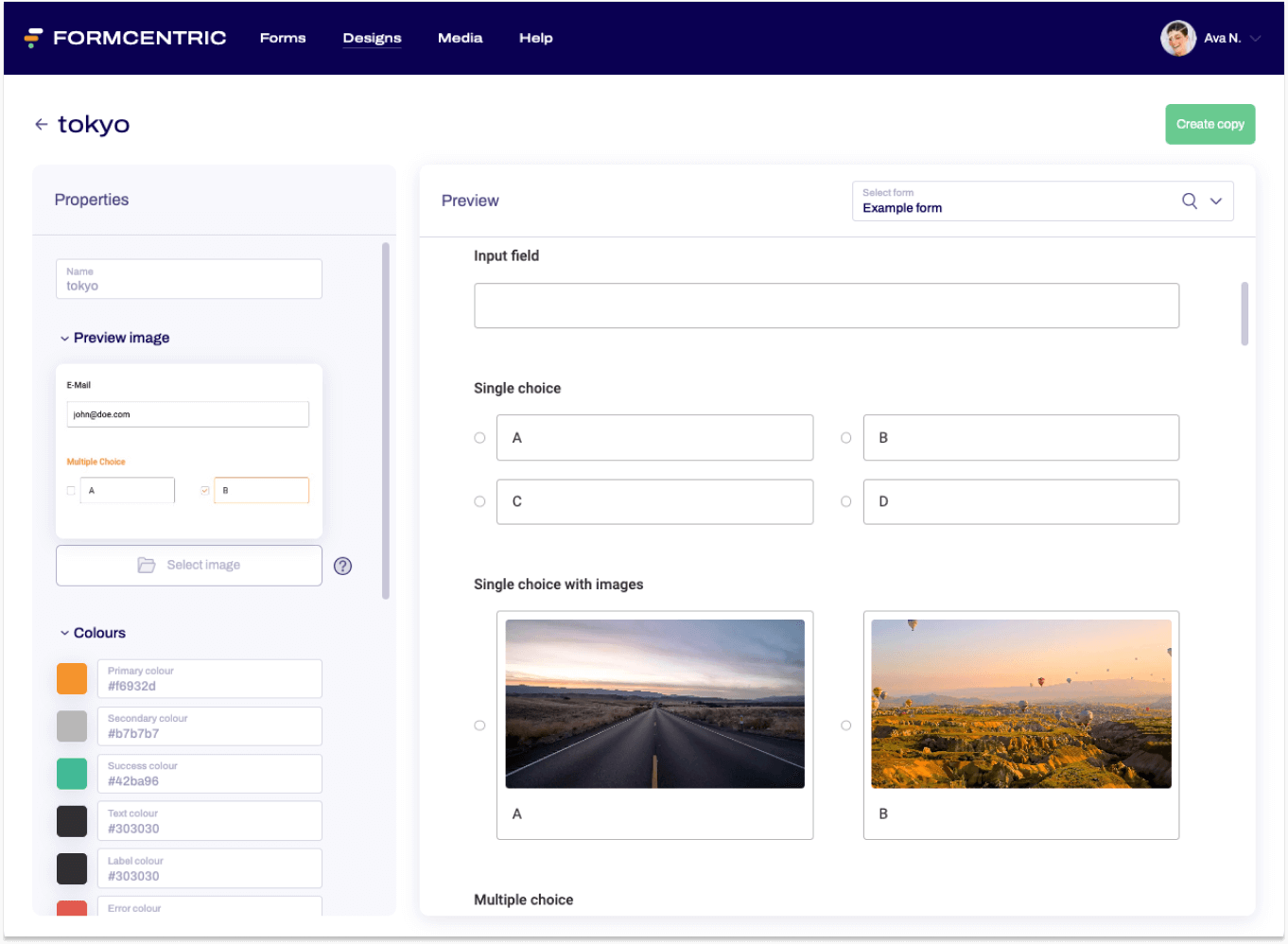
- In your selected design, click Create copy at the top right. A copy of the design is created, so that you can then use it as a template.
Step 2: Modifying the design
To modify a copy of a design to use as your own individual design, proceed as follows:
- In My designs, click the preview image for the copy that you created in the previous step.
The design opens. - Make adjustments to the design in Properties on the left.
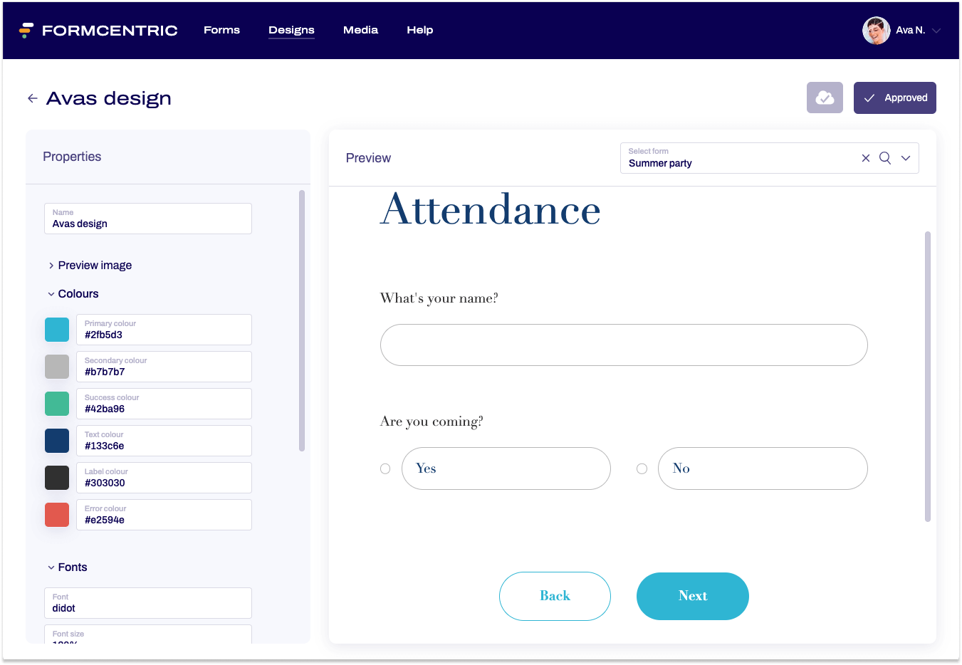
The effect that your changes have on the design and therefore on a form can be seen in the Preview on the right, which applies the design to a sample form.
If you want to preview the design with a specific form, then you can pick this form by using Select form at the top right of the screen. - As a last step, you can then approve the modified design. To do this, click Approve at the top right. You cannot select the design in the Share area or show the design in the Editor preview until the design is approved.
Adjustment options
All designs
You can make the following adjustments to any design:
- Name
Give the design a name, so that you can find it more quickly and identify the design you are selecting before sharing a form more easily. - Preview image
You can add an image here that will be used as the preview image for the design.
Design-dependent
The following adjustment options vary according to the design that you select.
Some or all of the following may be available:
- Colours
You can change the colours of individual form elements. To do so, click a colour and change the selected colour or enter your own hex colour codes. - Fonts
You can change the font face to any system font and also change the font size. - Other properties:
Border radius
The border radius option lets you specify whether borders have square or rounded corners. The radius is entered in pixels. The higher the pixel value, the rounder the corners.
Show validation icon
If you add required fields to your form, a tick mark is shown once users have filled out the form correctly. If you don’t want to show this validation icon, then replace block with none here. - Logo
Add a logo to your design. Once you have added a logo, this is shown at the top of each page of your form.