Input field
Last updated:
If you need fields where users can enter short pieces of text like their name, street, etc., then you need to use the single-line input field form field. As with all of the other types of form field, you can also customise this field in many different ways. You can specify whether the input field is a required field, for example, whether it displays some placeholder text or whether it is given a default value.
Adding Input field
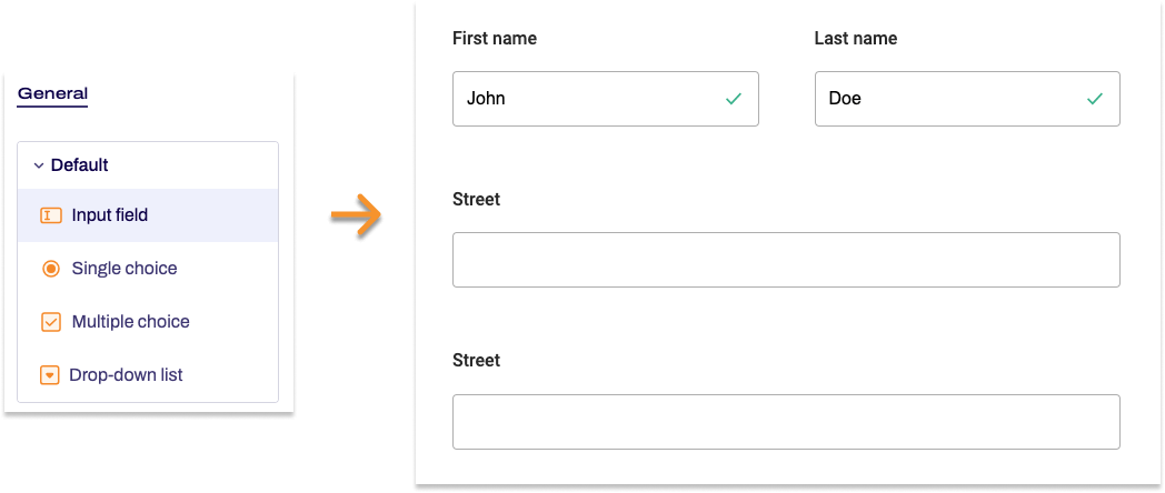
- In the Structure area, click the green plus sign.
- Navigate to General →Standard and click Input field.
You can now see the form element you’ve just added in the form tree. - On the right, under Edit Input field, you can now adjust the settings for your new form element as required.
Property |
Description |
||
| Label | Enter the text of the label to be displayed next to the form field. By default, the label is shown above the input field. | ||
| Technical name | Each form element that is added to a form is automatically assigned a unique name – known as the technical name – by Formcentric. This name is based on the designator for the form element. Alternatively, you can generate the technical name from the label. To do this, click New from label. Find out more about the technical name. |
||
| Short hint | Use the short hint to give users extra information or examples shown directly beneath the input field. | ||
| Note | Here you have the option of adding some text to your input field that gives users additional information, such as instructions about filling out the field. | ||
| Default value | Enter a piece of text to be shown in the input field when users access the form. Alternatively, you can enter a variable here that adds a value automatically to the input field – such as the date. Find out more about variables. | ||
| Placeholder | Enter a piece of placeholder text here. This text is shown greyed-out in the input field. This placeholder text disappears as soon as users start typing into the input field. | ||
| Max. length | Enter the maximum number of characters that users can type into the field so as to limit the length of their input. | ||
| Field width | Specify how wide the form element should be. Sometimes it can be useful to display form elements next to each other, e.g. street and house number. | ||
| Display variant | You can use this to add a CSS class from the website that you will be embedding the form into. The CSS class chosen here will be applied to the form element. Alternatively, you can select one or more display variants to apply to the form element. The article Custom display variants explains how to define your own display variants. |
||
| Autocomplete | Select a data source here to help users fill out the input field by autocompleting text in this field for them. As soon as users start typing into the input field, the system matches up this input to potential hits from the data source and users can then select the entry they want to use. Formcentric provides you with various default data source as Country names, Months, Years, and Weekdays. If you select the country name data source Country names, two fields appear: Key and Value. You can adjust how autocomplete works with the chars parameter that you set for Key and the number parameter that you set for Value. If you enter chars and the number 2, for example, then autocompletion starts after users enter the second letter. Learn more about data sources in the article Using data sources and parameters. |
||
| Read-only | If you check Read-only, users will not be able to change the text in the input field. Use this setting if you want to enter predefined variables into this input field. | ||
| Required field | Check Required field if this form field must be filled out when completing the form. An ‘*’ will then be added to the end of the label for this input field, marking it as a required field. Accordingly, users will be unable to submit the form or move to the next page (if this is a multi-page form) if they have not completed this form field properly. | ||
| Error message | If you check the required field box, an input field appears. In this field, enter the text shown to users if they try to skip filling out this form field. | ||
| Autofill | The Autofill option is active by default. This involves form data stored by the browser being suggested as autocomplete options for the form field. To improve the quality of these suggestions, you can tell the browser about the information that is expected for this form field.
|
||
| Validation | If you activate the Validation switch (move it to the right), a dropdown list appears. From this list, pick a validator to specify the format to be used for the text entered into the input field. For example, the email validator checks to confirm that users have entered a valid email address into the field. If the input and the format do not match up, then an error message is displayed. Find out more about validators in the article Validators. | ||