Drop-down list
Last updated:
The Drop-down list form element offers you a space-saving option for integrating various possible responses into your form using a list format. Users can click to expand your drop-down list and view the various options. When they select an option, the drop-down list then closes automatically.
If you want, you can also add a note to your dropdown list, so as to give users advice about selecting an option, for example. You can also specify whether one or more options can be selected. One of the options for selection in this field can also be set as the default option selected when the form is accessed. The form field can also be set as a required field. You can decide and specify all of these aspects individually according to your requirements.
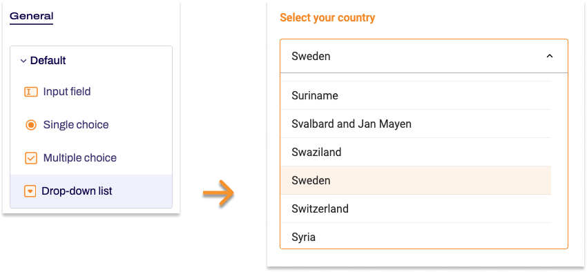
Adding Drop-down list
- In the Structure area, click the green plus sign.
- Navigate to General →Standard and click Drop-down list.
You can now see the form element you’ve just added in the form tree. - On the right, under Edit Drop-down list, you can now adjust the settings for your new form element as required.
Property |
Description |
||||
| Label | Enter the text of the label for the drop-down list. | ||||
| Technical name | Each form element that is added to a form is automatically assigned a unique name – known as the ‘technical name’ – by Formcentric. This name is based on the designator for the form element. Alternatively, you can generate the technical name from the label. To do this, click New from label. Find out more about the technical name. |
||||
| Short hint | Use the short hint to give users extra information or examples shown directly beneath the form element. | ||||
| Note |
Here you have the option of adding some text to your drop-down list that gives users additional information, such as instructions about filling out the field. | ||||
| Select image | This setting gives you the option of adding an image to be displayed next to this form element. | ||||
| Field width | You use the field width to set the width at which the drop-down list is shown in the form. | ||||
| Display variant | You can use this to add a CSS class from the website that you will be embedding the form into. The CSS class chosen here will be applied to the form element. Alternatively, you can select one or more display variants to apply to the form element. The article Custom display variants explains how to define your own display variants. |
||||
| Required field | Check Required field if an option must be selected from this form element when completing the form. An ‘*’ will then be added to the end of the label for this drop-down list, marking it as a required field. Accordingly, users will be unable to submit the form or move to the next page (if this is a multi-page form) if they have not completed this form element properly. | ||||
| Error message | In this field, enter the text shown to users if they try to skip filling out this form field. | ||||
| Options | Enter the options that you want users to see in the drop-down list. The text you enter is shown as the label for the option. The value of the option is generated automatically from the label, so you do not need to create it manually. You can add several options at once by entering each one on a separate line. To edit an option afterwards, open it in the form tree and make your changes there. At this point, you can also add an image to the option or set it to be preselected when the form is first accessed. |
||||
| Preselection | Here, you can specify that one or more options are preselected when the form is initially accessed. You can also select options generated from a data source. Enter the values for the corresponding options here. If there are multiple options, separate them with commas and activate Multiple choice. Let’s assume that you have added the Country names data source and you would like the option ‘Germany’ to be preselected. In the Country names data source, the values for the options match the country codes according to ISO 3166. Accordingly you enter DE here for Germany. If you want to select Portugal instead, you would enter PT accordingly. You can also use a variable. |
||||
| Data source | Select a data source here that you want to link to and use for the options in your drop-down list. The information provided by this data source will be accessed dynamically, i.e. at the exact moment that your users access the form. Formcentric provides you with various default data sources, as Country names, Months, Years, and Weekdays. You can enter additional parameters to the data source via Key and Value. The provided data sources do not require any parameters. Learn more about data sources in the article Using data sources and parameters. |
||||
| Placeholder | If you check Placeholder, you can enter a piece of text like ‘Please select’, which is displayed in the drop-down list. This disappears automatically once an option is selected. | ||||
| Multiple choice | Check the Multiple choice checkbox if your users should be able to select multiple options. | ||||
| User input | If you check User input, then users can enter their own option. | ||||
| Autofill | The Autofill option is active by default. This involves form data stored by the browser being suggested as autocomplete options for the form field. To improve the quality of these suggestions, you can tell the browser about the information that is expected for this form field.
Deactivate autofill Select Deactivate autofill to prevent the field from using autofill. This will also stop web browsers from saving the form field data. To do so, move the slider to the left, which deactivates autofill for this form field. |
||||