Short text
Last updated:
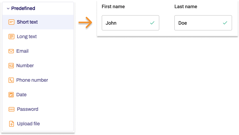
The single-line input field is probably the form field you will use most often in your forms. If you are expecting short, single-line answers from users that need no further validation, then you can use our predefined Short text form element. This element is ideal for form fields such as first and last names, for example.
Adding Short text
- In the Structure area, click the green plus sign.
- Navigate to General →Predefined and click Short text.
You can now see the form element you’ve just added in the form tree. - On the right, under Edit Short text, you can now adjust the settings for your new form element as required.
Property |
Description |
||||
| Label | Enter the text of the label to be displayed next to the form field. By default, the label is shown above the form field. | ||||
| Technical name | Each form element that is added to a form is automatically assigned a unique name – known as the ‘technical name’ – by Formcentric. This name is based on the designator for the form element. Alternatively, you can generate the technical name from the label. To do this, click New from label. Find out more about the technical name. |
||||
| Short hint | Use the short hint to give users extra information or examples shown directly beneath the form field. | ||||
| Note |
Here you have the option of adding some text to your form field that gives users additional information, such as instructions about filling out the field. | ||||
| Default value | Enter a piece of text to be shown in the form field when users access the form. Alternatively, you can enter a variable here that adds a value automatically to the form field – such as the date. Find out more about variables. | ||||
| Placeholder | Enter a piece of placeholder text here. This text is shown greyed-out in the form field. This placeholder text disappears as soon as users start typing into the form field. | ||||
| Max. length | Enter the maximum number of characters that users can type into the form field so as to limit the length of their input. | ||||
| Field width | Specify the width of the form element. | ||||
| Display variant | You can use this to add a CSS class from the website that you will be embedding the form into. The CSS class chosen here will be applied to the form element. Alternatively, you can select one or more display variants to apply to the form element. The article Custom display variants explains how to define your own display variants. |
||||
| Read-only | If you check Read-only, users will not be able to change the text in the form field. Use this setting if you want to enter predefined variables into this form field. | ||||
| Required field | Check Required field if this form field must be filled out when completing the form. An ‘*’ will then be added to the end of the label, marking this form field as a required field. Accordingly, users will be unable to submit the form or move to the next page (if this is a multi-page form) if they have not completed this form field properly. | ||||
| Error message | If you check the Required field box, an input field appears. In this field, enter the text shown to users if they try to skip filling out this form field. | ||||
| Autofill | The Autofill option is active by default. This involves form data stored by the browser being suggested as autocomplete options for the form field. To improve the quality of these suggestions, you can tell the browser about the information that is expected for this form field.
Deactivate autofill Select Deactivate autofill to prevent the field from using autofill. This will also stop web browsers from saving the form field data. To do so, move the slider to the left, which deactivates autofill for this form field. |
||||